Whether soft and sage-y or loud and lime-like, green is a natural choice for an island accent
Green is a popular color for kitchens because we associate it with freshness — in vegetables, fruits, herbs and more. But just as there are many different green-colored ingredients to cook with and eat, there are many shades of green paint to choose from when considering an island accent.
Monochromatic white kitchens have been extremely popular over the last few years, but one of the challenges of decorating in a single color is that you need to use elements other than color — such as texture, sheen and pattern — to visually break up the space and make it interesting.
That’s fine in most rooms, but in a kitchen you need to consider durability and how easy the surfaces are to maintain. This limits the materials you can use — a finish with a pronounced texture, for example, can be difficult to clean.
Color, then, can be your friend in the kitchen because it’s a simple way to add some zing. And an accent paint color on the island is relatively easy to change out later if you want to.
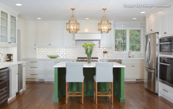
This kitchen is mostly white, but the touches of vegetal green, most notably on the island, give the space life and, in my view, make it more visually interesting than it would be if it was clad all in white.
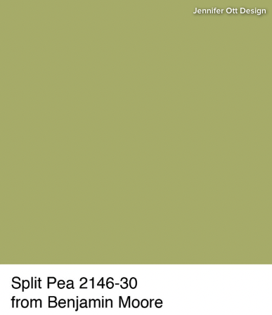
Tip: The island featured above is painted in Benjamin Moore’s Split Pea. When I look at a paint swatch of Split Pea, however, it looks quite different from the color I see on the island on my computer monitor. This is why it’s crucial that you always sample actual paint colors rather than selecting them based solely on a photo viewed online. Your architect or designer can guide you toward the right color choice for your project.
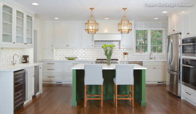
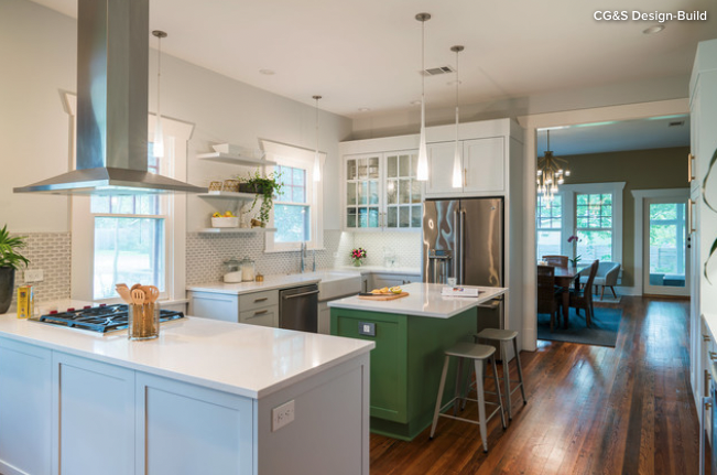
Here’s another mostly white kitchen that features a beautiful herbaceous green island as the focal point. It’s a fairly bold color, but because it’s partnered with a lot of white, it looks crisp without being too visually busy.
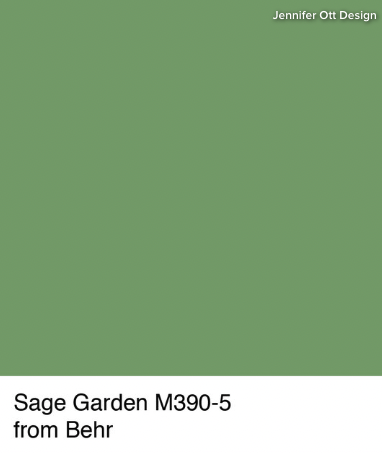
A similar color to try is Sage Garden from Behr. This particular color works nicely, as demonstrated above, when paired with warm elements such as hardwood floors and gold- or bronze-tone metallic finishes.
Tip: In a mostly monochromatic space, anything painted in a different color is going to stand out. That’s why it’s important to make sure the item is worthy of the attention. In this case, the island is truly the hub of the kitchen and is therefore the right focal element.
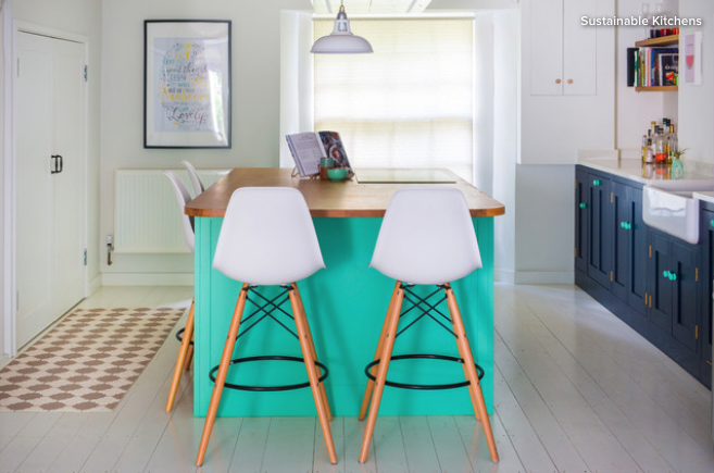
This color admittedly isn’t for everyone. It’s about as bold as you can go with green. But I give it a huge thumbs-up because it’s unusual and also used in a smart way. Because this is a clean and fairly minimalist space with no other bold colors or elements, the green is striking rather than garish.
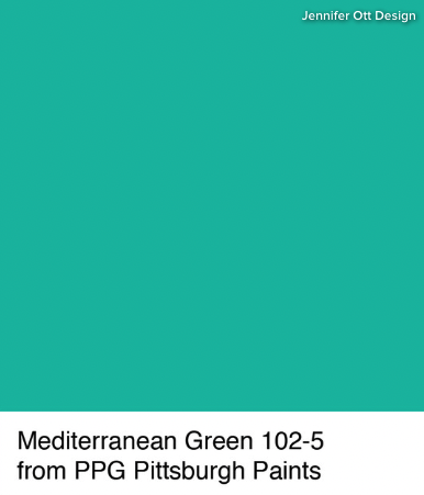
I strongly recommend working with one of our design professional who specializes in color if you want to go this bold. A pro can help determine if and how you can make a saturated color such as Mediterranean Green in your kitchen.
Tip: When selecting paint, there’s more to consider than color alone. Sheen is very important, especially on an island, which sees lots of wear and tear. A higher-gloss paint is going to be more durable and easier to clean, but the downside is that it more easily shows surface imperfections.
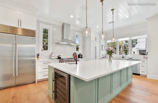
If the previous color example was a firm “nope” for you, then perhaps a soft silvery green like this is more palatable.
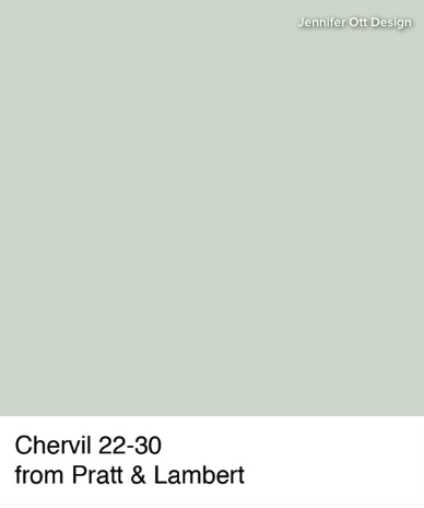
The key to picking a winning shade in this family is to find a color that has plenty of gray in it, which helps it steer clear of looking too sweetly pastel.
Tip: This kitchen is blessed with plenty of natural light, but if yours isn’t, you may want to keep the kitchen colors light. This whisper-soft green adds a little kick of color but the palette stays super soft and airy.
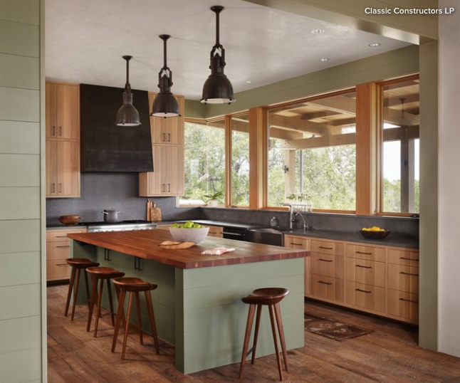
Here’s another subtle and soothing green, this one a bit warmer than the last option.
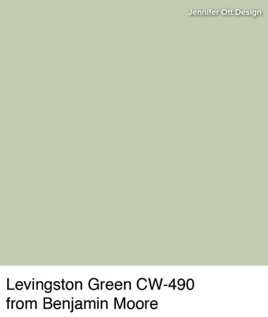
I would argue that this color can be used as a neutral, in that you can pair it with almost any other color. Benjamin Moore’s Levingston Green is a comparable choice that’s a nice alternative to white or off-white in a space.
Tip: If you live in a cold climate, think about bringing in visual warmth through color. Warm wood tones, such as used in this example, go a long way toward cozying up a kitchen. This green, being of the warmer variety, adds to the soothing vibe.
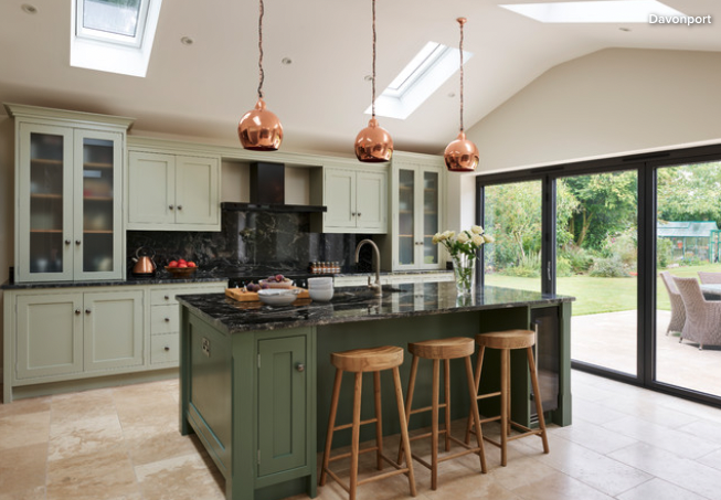
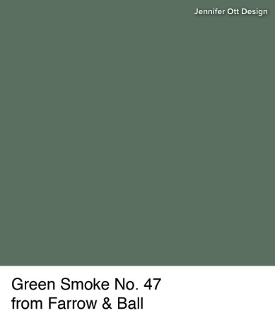
Two-toned cabinet schemes are hot with homeowners right now, and this kitchen, with its elegant shades of green, is a good-looking example.
It’s a lovely, organic palette that gives a nod to the beautiful yard just steps away.
Tip: If you want a space with many different materials, colors and textures, think carefully about the color palette. This kitchen features a variety of materials, sheens and colors, but because the colors are all fairly subdued, the effect is harmonious rather than busy or clashing.
This may be the smallest island featured, but what it lacks in size it more than makes up for in style. In fact, if your island is modestly sized, you can really have fun with color on it because it will be a relatively small dose in the kitchen.
written by. Jennifer Ott